
- Design
- 6 mins
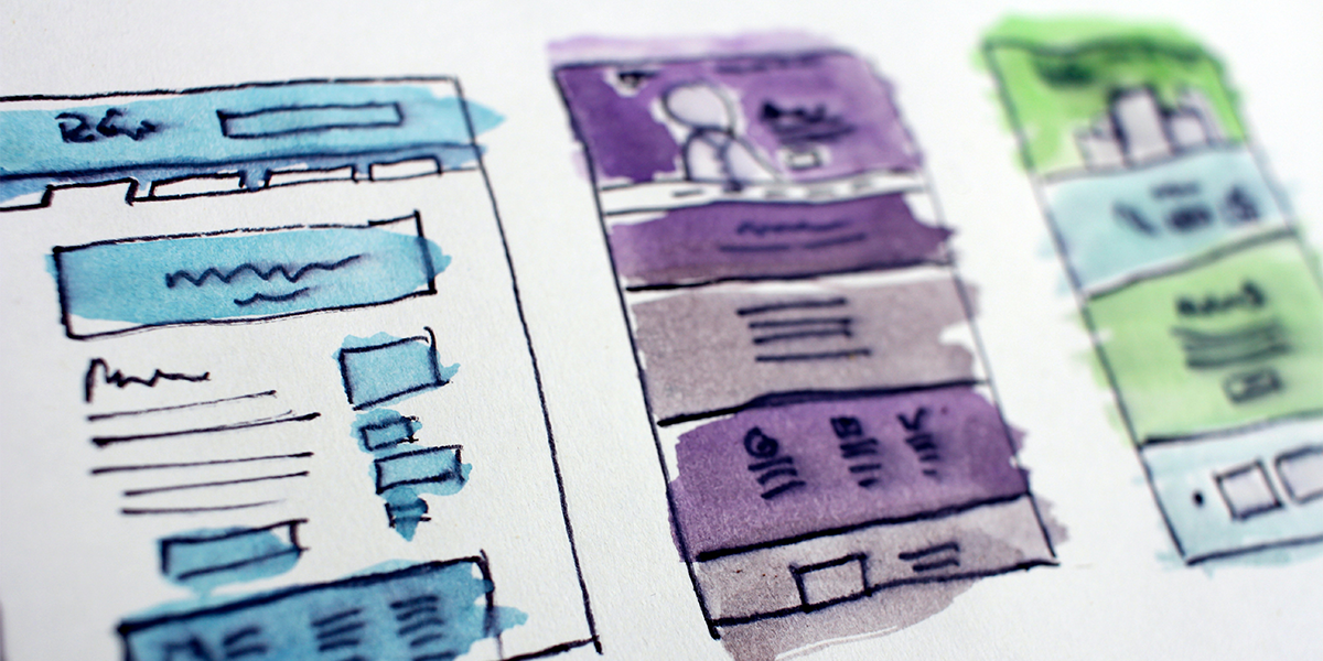
Not every organization has the luxury of an in-house graphic designer, but with these design resources and an understanding of basic design principles, your team’s marketing and graphics can rise to the next level. Establishing a creative process and tapping into free design resources can go a long way if you know how to use them. Designing for nonprofits isn’t always about style and trends. First and foremost, your marketing materials need to effectively communicate your message to your audience (and if you want to stylize it afterwards, that’s a bonus). That’s the idea behind Swiss Design Style, which can be summed up by its mantra, “form follows function.” This is a bit of Graphic Design 101 that I’m sharing with you. So, skip the art school use these five simple design principles to improve your organization’s visual communications.
Get familiar with the basics
There are 12 graphic design principles. If you want to read about all 12, you can check out this article, but today we’re focusing on these top five:
- Contrast
- Hierarchy
- Proportion
- Balance
- Repetition
1. Contrast: “the difference between various elements within a design, that makes them stand out from each other”
Variety in contrast is most often achieved through color and size. Highlighting a piece of information with a different color or enlarging text to give it emphasis can help direct readers where to look on the page. Consider changing contrast by using a different font (but please, no more than two fonts on one design), or through colors, sizes and graphic shapes.
2. Hierarchy: “the importance of elements within a design”
This design principle works hand-in-hand with contrast. The biggest thing on the page is usually the most important; therefore, it is awarded the highest hierarchy on the graphic. Downgrade less important information, like the fine print, by making it smaller in size or less contrasting in color. Upgrade more important information, like headlines or a call to action, by making them larger in size, using a bold font or making them a vibrant color. Keep in mind, only one piece of information can be the most important. Part of the creative process is to decide on the “hero” and let it shine. Then, prioritize the rest of the information on the page and assign design principles accordingly. A quick way to check your hierarchy is by closing your eyes for a moment, then opening them to look at your design – what did you see first? Is that what you want your audience to see first? Try this test with your colleagues that haven’t been working on the design and see what they think.
3. Proportion: “the size of the elements in relation to one another”
The larger the element on the design, the more important it is perceived to be – just like the design principles of contrast and hierarchy. That’s the nature of the human brain and there’s nothing we can do about it. Consider proportions appropriately. It really is that simple.
Are these design principles starting to sound the same yet? (They should!) A well-designed piece plays well with all the rules, and luckily, they’re easy to play by. Purposely knowing when to break the rules is the tricky part (we’ll save that for another blog).
4. Balance: “items of equal or different weights that are laid out in relation to a line that is centered (symmetrical) or off-centered (asymmetrical)”
Now that you have information on the page, you’ve decided what’s most important and how big or small to make it, it’s time to bring the design principle of balance into the mix. As you start to layout the design, try to keep it visually balanced - top and bottom, left and right. Varying contrast and proportions can visually weight the design differently. Maybe you center all the elements of your design for simple symmetry or try adjusting right and left justification of graphics and text for an asymmetrical balance. This design principle is based on more of a feeling than any hard rules. Keep it basic or make it unexpected, but be sure to save all your different variations along the way so you don’t have to start over when you decide on one. Just remember – you’re trying to communicate information effectively. Don’t let the fun of the design distract from the message.
5. Repetition: “reinforces an idea or perception”
We’ve come to our last stop in today’s lesson about design principles – repetition. Remember how I mentioned earlier not to use more than two fonts on a design? That’s because repetition provides consistency and familiarity. Using too many fonts or too many colors can feel disconnected and confuse the reader. Repetition across a single graphic and repetition within a brand are both important. Keep it simple and only repeat strong, recognizable elements. Establish what works well in your organization’s creative process and repeat fonts, colors and graphic assets across all your designs. Creating this visual consistency helps audiences identify graphics as unique to your organization. Consider practicing this with your next marketing or fundraising campaign by repeating graphic styles, layouts, fonts and colors across social media graphics, flyers and brochures to create a coordinating set of materials. By establishing a library of assets like this, you’re creating a formula to follow for anyone on your team to create designs, whether or not they’re familiar with these design principles.
Take advantage of free design resources
Even though you’re now armed with these design principles, don’t feel like you need to start from scratch just to put them to use. There are so many great design resources available. Get your website bookmarkers ready! Here’s a few of my favorite free design resources:
- Unsplash.com
Unsplash has free stock photos that offer a new variety of modern images for every subject matter and aesthetic, no matter how traditional or trendy. - Ouch! at Icons8
These are incredible illustration sets from Dribble designers. There’s a wide variety of styles from flat icons to 3D vectors, realistic to experimental. The best part is these illustrations come in sets, so if you find something you like, you have a lot of options to choose from and keep using. Sometimes I can’t believe this design resource is actually free! - The Noun Project
This website is the best design resource I’ve found for free icons. Find a set or artist you like, and you’ll have matching icons to use across all your organization’s materials. - Canva
If you haven’t tried Canva yet, you’re missing out! Its user-friendly interface is simple enough for design novices and dynamic enough for professional creatives. It’s a great alternative to costly design software and is ideal for creating social media graphics. There’s also a lot of great tutorials to help you learn and use this tool. - This blog!
Bookmark this page for quick reference to design principles and design resources!
Get inspired and start creating!
Hopefully you’re feeling more confident about creating your own graphic designs for your nonprofit organization. Next time you have a social media graphic, a flyer or a postcard to create, I challenge you to form your own creative process, remember your design principles, and use the design resources available to you. You got this!
But hey, if you don’t “got this,” we’re also here to help. Every nonprofit is a busy one! If you feel overwhelmed by your organization’s creative needs or just need an extra hand, don’t hesitate to call the professionals. Our team at Dot Org Solutions is always available to help with your creative services (and more!).
Like what you read? Subscribe to our weekly blog and it will be delivered directly to your inbox!
Resources: